Dear person marking this work,
I would like first to thank you for taking the time to review and look around my blog which works as a home for my work. I would also like to say how much I value some of the skills that I have learned during the teaching of this course, which I hope to use later in life (such as photoshop techniques).
Saturday, 9 April 2016
Friday, 8 April 2016
Thursday, 7 April 2016
Evaluation Question 7


One of the major skills that I learned from the preliminary task was basic photoshop etiquette. Having never used photoshop before, it was quite the steep learning curve. Simple things such as selecting layers instead of clicking on an image or text and which tools to use for what eventually became very intuitive. If it wasn’t for the preliminary task, I would have spent a large percentage of my time just trying to work out how to do things which would have restricted how creative I could have been.
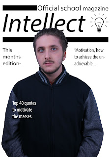
The second thing that I learned from the preliminary task was not to use such a blank cover or contents page. There is a big difference between minimalist and blank, not only was my preliminary task blank (devoid of any decent page furniture) but where I tried to fill in empty spaces and add interesting features, it came out looking tacky and unprofessional.
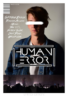
Thirdly, I learned which poses look bad and managed to find a pose that looked good based off my preliminary cover. The main difference between the pose on my preliminary cover and the pose on my final cover is the artist tilting his body away from the camera slightly instead of directly into the lens, this makes the artist seem more natural and also gives off a feeling of discontent or angst which would subconsciously be reciprocated in my target audience, allowing them to associate themselves with the artist more easily. Without the preliminary task I would have spent more time taking photos of my artist in positions that I thought would look good (facing the camera directly) and would have not come out with a decent image of my artist doing a suitable pose. This would most certainly have left my magazine looking worse off.
Wednesday, 6 April 2016
Evaluation Question 6
What have you learnt about technologies from the process of constructing this product?
Photo editing software:
Photoshop allowed me to change the colouration of photos, or remove blemishes e.t.c post taking them. I used this a lot when using abstract techniques to try and make my cover image stand out. This can be done by using effects or simply altering the contrast and brightness. Another way is to blur or sharpen images in a way that makes certain areas of the photo's subject stand out against the background and foreground, another popular way is putting parts of the image in front of the masthead or making a border around the image with the colours emphasising the subject. Another thing that I learned from the process of constructing this product is how to add subtle page furniture in an attempt to create motifs. One motif I attempted to establish consisted of using the brush tool to block out the eyes of the subject on the cover. I also utilised the same tool behind the page numbers so that it appeared on all of the pages not just the cover.

Camera:
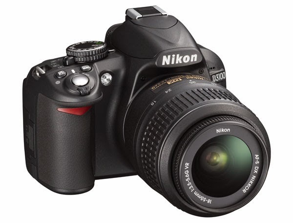
The techniques I learned to use for the camera are mainly related to lighting and subject composition.
For example, in my preliminary task my artist looked straight into the camera and also had his body facing towards the camera. I realised that this framing does not look professional or inline with the style i was hoping to achieve. So instead i decided to have my artist turn to the side and look away from the camera, tis created a much more stylish photo and fitted with the rest of my cover and magazine more.
Blogger:
I used a blog as a way of keeping track of what work I have done and what work i was yet to do. Blogger provided a very user friendly way of achieving a sort of 'digital portfolio.' This meant I was able to complete work from home and different computers around the school with it all remaining in one place. It also makes it easier for teachers and peers to comment on my work meaning i could improve what I have done post-upload.
The ability to access work from anywhere on virtually any device was extremely valuable and stopped me from losing work or notes like i often do when they are in physical form. It also makes the organisation of notes and completed pieces of work very simple and easy to do.
Photo editing software:
Photoshop allowed me to change the colouration of photos, or remove blemishes e.t.c post taking them. I used this a lot when using abstract techniques to try and make my cover image stand out. This can be done by using effects or simply altering the contrast and brightness. Another way is to blur or sharpen images in a way that makes certain areas of the photo's subject stand out against the background and foreground, another popular way is putting parts of the image in front of the masthead or making a border around the image with the colours emphasising the subject. Another thing that I learned from the process of constructing this product is how to add subtle page furniture in an attempt to create motifs. One motif I attempted to establish consisted of using the brush tool to block out the eyes of the subject on the cover. I also utilised the same tool behind the page numbers so that it appeared on all of the pages not just the cover.

Camera:
The techniques I learned to use for the camera are mainly related to lighting and subject composition.
For example, in my preliminary task my artist looked straight into the camera and also had his body facing towards the camera. I realised that this framing does not look professional or inline with the style i was hoping to achieve. So instead i decided to have my artist turn to the side and look away from the camera, tis created a much more stylish photo and fitted with the rest of my cover and magazine more.
Blogger:
I used a blog as a way of keeping track of what work I have done and what work i was yet to do. Blogger provided a very user friendly way of achieving a sort of 'digital portfolio.' This meant I was able to complete work from home and different computers around the school with it all remaining in one place. It also makes it easier for teachers and peers to comment on my work meaning i could improve what I have done post-upload.
The ability to access work from anywhere on virtually any device was extremely valuable and stopped me from losing work or notes like i often do when they are in physical form. It also makes the organisation of notes and completed pieces of work very simple and easy to do.
Tuesday, 5 April 2016
Monday, 4 April 2016
Sunday, 3 April 2016
Saturday, 2 April 2016
Friday, 1 April 2016
Sunday, 27 March 2016
Draft evaluation question 3
What kind of media
institution might distribute your media product and why?
The ‘kind’ of media institution required to distribute my
product successfully to my designated target audience would be one that
provides not only money and channels of distribution, but one that also leaves
creative control to the designers and allows the magazine to really stand out
on it’s own away from demands or requirements usually set out by distribution
companies.
With these requirements, the most promising media
institution is most likely ‘COMAG specialist’ (part of COMAG group) due to
their focus on ‘niche’ magazines. I believe that this suits my magazine due to
the fluid nature of my chosen target audience and the manner at which they so
casually dispel genres and artists e.t.c. as soon as they become popular or
mainstream. When this happens to items featured in a magazine, a lot of the
time the magazine itself also begins to build a growing fan base until it has
become popular or mainstream. This is usually desirable as it would see
increased sales and value of the magazine, translating into higher profits. But
if your aim is not to create a short term, profitable business venture that is
quickly forgotten by the music industry but to create a long lasting,
constantly evolving product seeking to provide an in depth review of the most
obscure and eccentric musical creations then you should not base your success
on monetary gains. Instead, the success of this magazine would be based on the
long term predictions of trends in music, sometimes years before something
would enter the mainstream, especially newly formed genres. To be allowed to
judge a media product in this manner, an institution would have to have a lot
of trust in the producers of the product in the face of low sales and little
influence. I believe that ‘COMAG specialist’ would be one of the few media
institutions prepared to ‘play the long game’ and turn down offers of
sponsorship or celebrity endorsement (apart from a select few icons) as they
would ‘taint’ the brand. The whole reason for things like that being so bad for
this particular magazine, is due to the fact that the target audience
(scenester) is closely related to the ‘activist’ tribe that will avoid
commercial products or services etc. on ethical grounds (i.e not using amazon
due to their tax dodging) so it would be too improbable that they boycott a
magazine for their association
Saturday, 26 March 2016
DRAFT evaluation question 2
How does your media product
represent particular social groups?
The first and obvious way that my magazine represents one
particular social group is through the model. The person that I used to
represent my fictional artist represents several social groups such as male,
young and white British. The clothes that he wears also allow several social
groups to associate with him such as ‘indie’ or ‘scenester’ due to his denim
jacket and hairstyle.
Beyond the physical image of the ‘artist’ the perceived
political and philosophical image that I created through his language in the
article that allows readers from certain social groups to identify further not
only with him, but the media product and production company as well. One
example of language that is found in most generic ‘indie’ or ‘scenester’ media
products is where he denounces using labels for both music and people in
general “I think the whole world would benefit greatly if we stopped trying to
label everything.” Whereas the media is constantly playing catch up with what’s
‘P.C’ some groups have begun trying to rid the world of labels all together,
claiming that all they achieve is to hinder progression. So the reason that I
wrote the article in this style is to try and match the opinions of these
groups, and draw them into this media product through the association of the
artist and the magazine. So even though the magazine is not directly representing
their views, it is indirectly voicing their opinions through the featured
artist.
Based on the UKtribes research that I carried out prior to
taking photos etc, the group that I wished to represent the most was a ‘tribe’
named ‘scenesters’ which is made up of young people striving to find “what’s
next before it has a chance to become what’s ‘now.’” To represent this group is
inherently difficult due to their constantly fluctuating interests in line with
what has made it to the mainstream, and what is being created every day. So to
try and attract this group to my media product, I had to be careful not to
include elements that might deter them from purchasing it. This is one of the
reasons why I chose to take a minimalist approach so that I could avoid
accidentally using anything that would contradict their evolving interests.
Thursday, 24 March 2016
Draft evaluation question 1
In what ways does your media
product use, develop or challenge forms and conventions of real media products?
The first way in which my magazine uses conventions is the
use of an eye catching masthead. The font used (Prometheus) was downloaded from
‘www.DaFont.com’ and features very bold, yet minimalistic letter styles which
works well to draw the reader to it but also works well with the rest of the
‘graphology’ used on the front cover and beyond. The actual title I used ‘HUMAN
ERROR’ can be seen as a challenge to conventions as it presents a slightly
negative sounding comment. A lot of music magazines try and present a positive
‘scenario’ such as ‘WONDERLAND’ ‘MOJO’ or even ‘VIBE’ which all have positive
connotations. ‘HUMAN ERROR’ on the other hand sends a message of imperfection,
utilizing a term usually used to describe accidents such as plane/car crashes
that is the fault of the pilot/driver. The reason for this hinges on the target
audience. The target audience of my magazine is select and made up of young
people who have a passion for music, but are constantly seeking new and obscure
bands/genres etc. that cannot even yet be described as alternative. Due to
this, they are also likely to reject popular/mainstream music and even most
‘indie/alternative’ bands. This also leads me to believe that their view on the
music industry is slightly negative and pessimistic with the overriding opinion
that it is ‘going downhill’ most likely since either the ‘90s or ‘60s depending
on who it is you ask. So this more negative message subconsciously associates
them with this magazine as it is presenting music that is untouched from the
corporate and money focused ‘industry’ as a new and fresh alternative. The
minimalist nature of the magazine cover develops conventions as although many
magazines take the ‘stripped back’ approach, they do this as a stylistic
decision. The reason for the ‘quiet’ nature of the cover on ‘HUMAN ERROR’ is
related to my last point about challenging the industry; the lack of
advertisement and sponsorship is an attempt to build a partition between
corporate magazines and this one.
Another way, in which conventions are developed, is the
motif I created when I used Photoshop to block out the face of the featured
artist slightly. This motif would be continued in various ways throughout
subsequent editions similar to ‘I-D’ magazine’s motif of having the person on
the front page cover one of their eyes by either blinking or possibly using
props etc. The way in which this develops conventions is due to the fact that
the view of the featured artist/artist is restricted more than on the covers of
‘I-D’ magazine, which is unconventional as almost all magazines seek to
advertise and exaggerate their artists as much as possible and not limit their
image. The reason that allows me to justify this motif is due to the fact that
most featured artists will be unheard of to readers, so their image is not
necessarily a selling point. (Also, the target audience most likely to read
this magazine will not fall for common tricks of other magazines i.e. to put
the most attractive people on the front cover to encourage attention.) The
frequent use of this motif would also make the magazine standout on a shelf
surrounded by other magazines, which would lead to higher sales.
The contents page generally follows conventions set out by
magazines such as ‘VIBE’ as it features a ‘stripped back’ look (in conjunction
with the overriding style of the ‘mag’) and an image of an artist as well as
the text being in one, basic column. The way in which my contents page
challenges conventions is the placement of the image of the artist as it is
slightly transparent and covered by text etc. so it does not stand out very
much.
One way in which my double page uses conventions of real products
can be seen on the double page spread. There are several conventional elements
that can be found across the page such as the layout of the text and the
portrait being of the featured artist. The heading of the article is in the
same font as both the masthead and the contents page heading. This is a common
convention that introduces continuity into the magazine and begins to develop a
specific motif, tailored to the target audience. The text is also aligned both with the
outline of the page, and the other items on the page in a traditional manner.
There is a ‘drop cap’ embedded into the main body of text and all of the words
are flush either to the left or right depending on the column. The heading and text
grab are in line with both; each other and the main body of text. This makes
the article look genuine and the graphology I have used adds to the overall
‘minimalist’ theme. The colour scheme I adopted for the double page also adds
to the theme as I only used black and grey text. Not only this but the image of
the artist that I decided to use is a silhouette so does not interfere with the
overall style.
The way in which my double page spread further develops
conventions is through the content of the article. To make the article seem
genuine I employed a writing style that seems to reflect a level of poised
assertiveness within the featured artist’s language. For example the quote “for
me it isn’t just a philosophy, it’s how I think” presents an argument pushed by
many people who see themselves as confident and righteous (my target audience)
although these views may not be interpreted as such by the majority.
Subscribe to:
Comments (Atom)


