Sunday 31 January 2016

Test Shots.

These are some test photographs that I took in order to finalise the plan for my front cover, they helped me to understand what worked well with my featured artist and what to leave out/include in my final shots.


Friday 22 January 2016

Magazine title

'Clangerent' (pronounced [clan-ja-rent]) means 'sound' in latin. I have picked that as my title as latin is a language not touched upon in the mainstream apart from a few sayings that have cultural resonance (i.e 'alibi' 'audio' 'ergo' etc). As i am aiming for the 'scenesters' as my main audience it makes sense that i attempt to enter a new word into the current ranks of words and phrases that people don't even know are latin. (that and 'clangerent' has a sound that fits well with a music magazine)

Language register


After analysing many other music magazines within the market, some of a similar genre to what I am aiming to create (Indie) and others not so similar (such as Hip Hop), I have come to the conclusion that it will be most viable and suitable to write my text in Standard English. Although some elements of slang and informal language may be used to suit the audience and to some extent the genre, I aim for not to detract from the publications class. I feel writing it in this style will keep my audience interested, but also make it clear, easy and crucially enjoyable to read.

Wednesday 20 January 2016

Audience profile- UK tribes

The main group or 'tribe' that i will be focusing my magazine around is the 'Scenesters.' This is because they generally lead the trend when it comes to music and fashion etc. I want my magazine (and subsequently the band featured) to be in some way alternative, but not just alternative in the way that all indie music is 'alternative,' but different in a way that is new and fresh. If i manage to find some way to be original then it will not appeal to a mainstream audience on its own. So i must first make my product desirable to the 'tribes' that root out new and fresh fashion, brands and music so that they can then present it to more mainstream groups such as Young alternatives until it finally reaches the 'Trendies' or 'mainstream.'

This is essentially a journey that a brand or cultural product must go through if it does not have the money or support necessary to get straight into the mainstream, to get into the mainstream. It also makes it easier to point out a specific target audience as i am aiming to have my product viewed by the 'scenester' crowd who are a very select group of trend predictors and setters.

This 'tribe' is very music oriented and constantly looking for new bands but also new ways of discovering them. They usually attend small gigs or festivals that are in their 'adolescence' and are yet to reach corporate stardom like festivals such as Glastonbury which started as a small 'hippie' gathering of 1 500 people, reading festival began as a jazz festival. Point being that the small, unsponsored festivals that this tribe frequents will one day likely evolve into larger mainstream cultural events. So targeting these events would most likely result in a devout scenester following of my magazine.

Monday 18 January 2016

Colour Palette

Along with the font, the colours I use in my magazine will be a vital element to the overall look and feel for my magazine, and what experience it will create for my reader. All of my colour palette initial ideas include black and white, two neutral, contrasting colours witch will easily one more colour. I have chosen subdued colours in the green, red and blue bands which have been added to add a small detailing colour to the selection. I want my magazine to be stylish and not garish The combination of the colours mentioned will be suitable in my magazine. The red/green/blue are not too bright, but will add an element of contrast from the black/white which I will use to highlight certain elements of the magazines text.

Sunday 17 January 2016

Photographers


Photographer’s


Patrick Demarchelier 2010 Tribeca Shankbone.jpg
  • Patrick Demarchelier- French fashion photographer that has shot cover for ‘rolling stone’ ‘glamour’ ‘life’ ‘newsweek’ ‘elle’ and ‘madamoiselle.’  In 2007, Christine Albanel, French Minister of Culture, honored Patrick Demarchelier as an Officer in l'ordre des Arts et des Lettres (Order of Arts and Literature).


  • Steven Meisel is an American fashion photographer that is considered one of the most successful in the industry. He worked for ‘seventeen’ magazine and currently works for American and Italian vogue for which he was photographed every cover for 20 years. He has also worked for and contributed to Madonna and Mariah Carey.

  • Terry Richardson 2011.jpgTerry Richardson- an American fashion and portrait photographer that has worked for magazines such as ‘rolling stone’ ‘vogue’ ‘i-D’ and ‘vice.’


  • John Rankin is a British fashion and portrait photographer that started ‘Dazed & Confused’ with Jefferson Hack and has since ran campaigns for nike and Bono.

Wednesday 13 January 2016

Cover analysis


Contents page analysis

The contents page I have chosen is from the music magazine NME. They layout for this contents page is similar to the previous Q magazine that I analysed. Having a large image in the centre of the page draws all the attention to the image. This is a conventional look for NME as they do use this layout frequently with their contents pages as well as lots of other magazine companies, such as Q.
NME have used a very mainstream colour way for their contents page. Black, white and red gives the reader an attractive feature for their page. The red on the page stands out against the black and white which is used to emphasis key parts off the contents page. For example they have used the red for the NME in the masthead which attracts the attention of the reader.
The text that has been used for this contents page is standard giving the magazine a simplistic look. The masthead is in a large font placed at the top of the page which is conventional with this type of magazine. The cover line headers are place around the image to settle the main image. There is lots of text on the contents page telling the reader about what is inside. The text is in a standard font and colour to give a realistic look for the magazine. It doesn't seem like NME have taken  a big risk in making this contents page as it is basic and conventional.
The main image used for this contents page is placed towards the top of the page below the masthead. This is a conventional look for a magazine contents page. The image is quite large which brings the attention of detail to the image rather than the text. The image is of a band called Arctic Monkeys and the image has one of the band members playing the guitar. This gives the reader an expression of the genre of music that the magazine is about. The reader should be able to recognise the genre of music from the clothes and hair style of the artist in the image. The image doesn't have the person looking directly into the camera which can be an opposite effect of grabbing the reader’s attention.
The second contents page that I have chosen is from the indie music magazine, 'Q.' With a similar colour palette and layout to 'NME' it would seem to be too similar to be worth analysing. However, their are several features of this cover that resonate with me and with my vision of what my final magazine might hopefully look like.


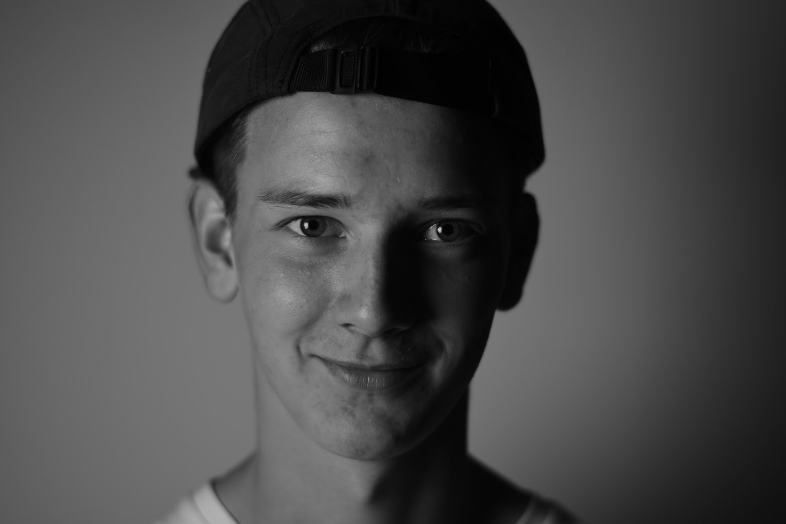
The first and main feature that I wish to recreate is the image of the featured artist being clearly displayed alongside the text. The way that only his face is in focus and he is staring directly into the camera seems to really engage the audience, as if he were staring at them individually.


The second feature which I believe is an improvement on the 'NME' cover is the lack of advertisements and general 'clutter' that detract from either the image or contents. Where the 'NME' cover is loud and brash, trying to attract your attention directly, the 'Q' cover is more relaxed, it draws you in in a way that makes it seem unintentional.


Thirdly, the emotive language used in the titles of the articles is another subtle way of making your product attractive to your chosen audience. Words such as "pathetic" and (ironically) "Bravery" incite interest towards the articles and magazine presenting them alike.
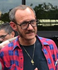
Double page spread analysis