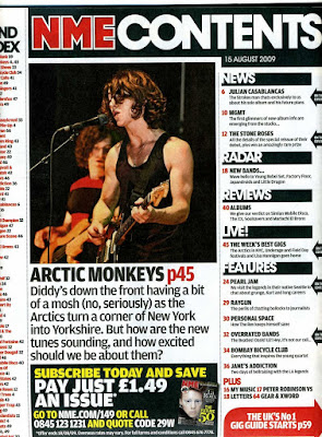
The contents page I have chosen is from the music magazine
NME. They layout for this contents page is similar to the previous Q magazine
that I analysed. Having a large image in the centre of the page draws all the
attention to the image. This is a conventional look for NME as they do use this
layout frequently with their contents pages as well as lots of other magazine
companies, such as Q.
NME have used a very mainstream colour way for their
contents page. Black, white and red gives the reader an attractive feature for
their page. The red on the page stands out against the black and white which is
used to emphasis key parts off the contents page. For example they have used
the red for the NME in the masthead which attracts the attention of the reader.
The text that has been used for this contents page is
standard giving the magazine a simplistic look. The masthead is in a large font
placed at the top of the page which is conventional with this type of magazine.
The cover line headers are place around the image to settle the main image.
There is lots of text on the contents page telling the reader about what is
inside. The text is in a standard font and colour to give a realistic look for
the magazine. It doesn't seem like NME have taken a big risk in making this contents page as it
is basic and conventional.
The main image used for this contents page is placed towards
the top of the page below the masthead. This is a conventional look for a
magazine contents page. The image is quite large which brings the attention of
detail to the image rather than the text. The image is of a band called Arctic
Monkeys and the image has one of the band members playing the guitar. This
gives the reader an expression of the genre of music that the magazine is
about. The reader should be able to recognise the genre of music from the
clothes and hair style of the artist in the image. The image doesn't have the
person looking directly into the camera which can be an opposite effect of
grabbing the reader’s attention.
The second contents page that I have chosen is from the indie music magazine, 'Q.' With a similar colour palette and layout to 'NME' it would seem to be too similar to be worth analysing. However, their are several features of this cover that resonate with me and with my vision of what my final magazine might hopefully look like. The first and main feature that I wish to recreate is the image of the featured artist being clearly displayed alongside the text. The way that only his face is in focus and he is staring directly into the camera seems to really engage the audience, as if he were staring at them individually.
The second feature which I believe is an improvement on the 'NME' cover is the lack of advertisements and general 'clutter' that detract from either the image or contents. Where the 'NME' cover is loud and brash, trying to attract your attention directly, the 'Q' cover is more relaxed, it draws you in in a way that makes it seem unintentional.
Thirdly, the emotive language used in the titles of the articles is another subtle way of making your product attractive to your chosen audience. Words such as "pathetic" and (ironically) "Bravery" incite interest towards the articles and magazine presenting them alike.


No comments:
Post a Comment